Social Circle
A mobile app which will help users to cope in a new environment by connecting with new people, discovering groups and attending new users.
The Problem
Relocation comes with some difficulties, like feeling lonely due to lack of social circle, adapting to the new culture etc.
There is a lack of social engagement, difficulty in understanding and adaptability to the new lifestyle.
Social Circle helps such people to build a new community for themselves by connecting with individuals, discover various groups of their interest and go out for events.
The Solution
Develop a safe and inclusive space for users where they can meet new people and attend various activities taking into account their needs and interests.
My Role
As a UX designer I am responsible for all the stages of design that this project underwent. Starting with user interviews, synthesis of data, to wireframing , prototyping and usability test I worked extensively on all the stages.
The question arises:
How might we help people who have recently relocated to cope with their emotional and social changes?
Our goal ,
would be to create a new social environment for people who keep relocating, as per their behaviors' and need.
Setting up the user’s social goals by creating a profile with an accurate representation of oneself so that they can meet like minded people. Once they come to know each other better through chatting they can opt for video calling and then finally meet in person. They can also take part in pre planned group activities of their interest where they can meet people of different ethnicity and culture.
Screener Surveys
Online surveys were floated out in different platforms to recruit participants for the user interviews. By answering the different question in the screener survey, it told me if the participants were suitable to interview for the research of my app.
User Interviews
"Always a good experience when I attend any social meeting or gatherings. Its just a matter to get yourself out of the house because you are always occupied with stuff, going around you in mundane life, but once I go and meetup people I always feel good."
-one of the user
" Its a really big hassle to move to a new country plus it is very stressful and expensive. I have moved every 2-3 years in my lifetime but every time its the same feeling, starting over each time. I don't have a constant friend group in any city, I just know random people scattered around."
Conducting interviews for this project was fascinating. I started recruiting a total of five people from the participants of screener survey. Each interview was scheduled for 30mins with 9-10 set of questions and with the permission of my interviewees I recorded the whole session.
Each interviewee had different kind of experience and a new perspective .
On not having all the information about the new place, one of them said, “There is an issue of language barrier thing or me not knowing a holiday because I am a foreigner."
Experience on using other app to make friends, "Bumble was less daunting because you are seeing one person at a time and you just meet one on one. In Facebook it was bigger group people."
Though there are few social media app in the market offering services to help build friendship and take part in events, but I wanted to integrate all these function into one app instead of just people swiping out profiles. I wanted to offer something more engaging and rewarding for daily activities.
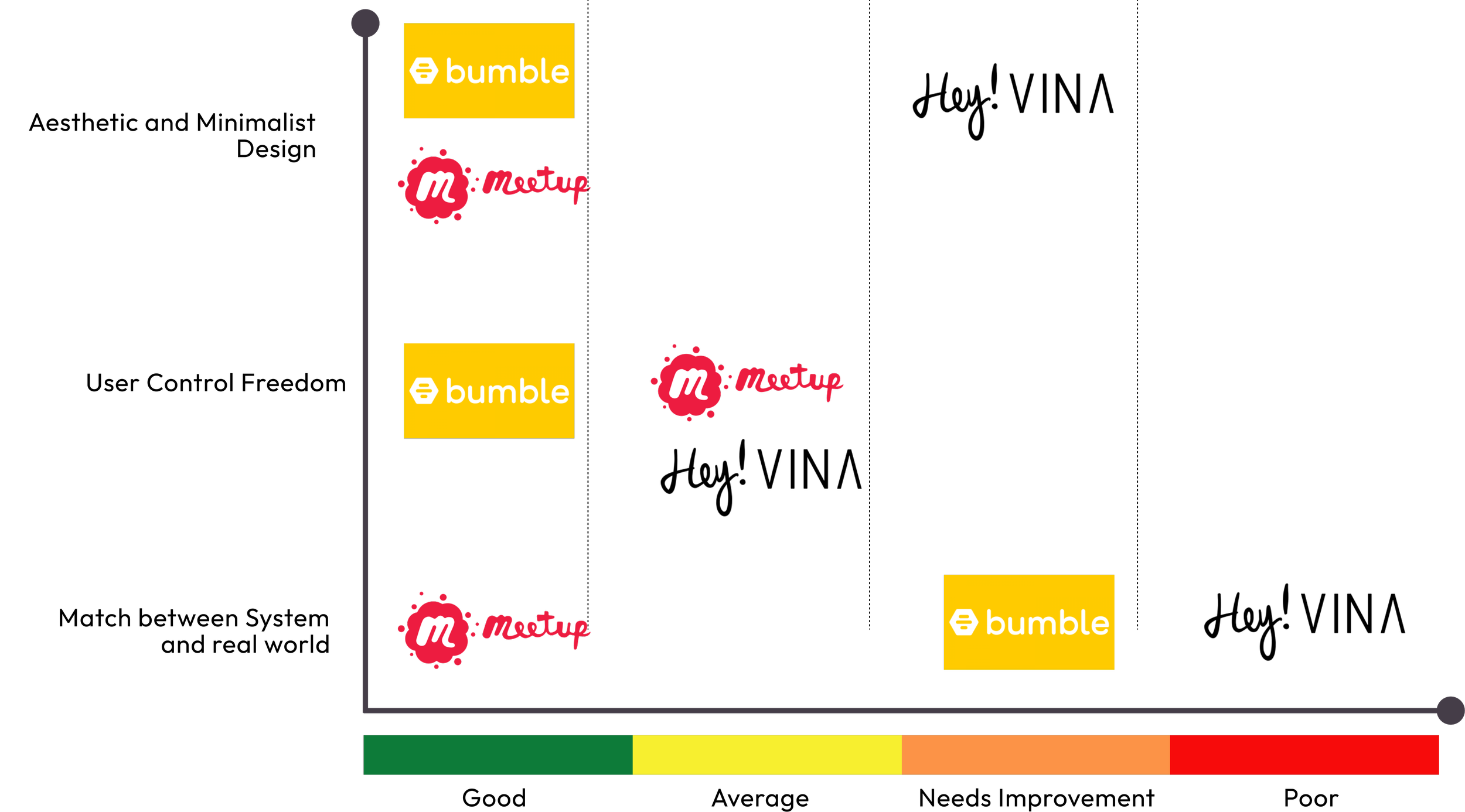
Competitive Analysis
My findings
Meetup:
User friendly language
User control and freedom
Clean and minimalist design
Bumble BFF:
Language used is confusing
Inclusive design and helps users maintain their privacy.
Appealing interface
Hey Vina!
Complicated language used
Inconsistent design
Empathy Mapping
Does
Makes new friends.
Goes for language class
Plans activities as per the kind of comfort in friendship.
Used other apps to make friends.
Explores new places
Goes for a lot of outdoor activities.
Tries out new sports and unique experiences.
Says
Sometimes I am like if I have free time I don't know what I am gonna do.
I am not good at making plans myself, I am lazy, I rather get invited.
Whoever goes to any new country, that place is new you don't know anyone so it's a huge difference from the country you are living in.
Moving to another country is challenging because you have to move away from friends and family. That's probably the hardest part.
Thinks
Knew someone else who was going through the same thing at the same time would have helped.
Big groups doesn't not give any memorable experience.
In recent times the apps has helped a lot in connecting with friends and family.
Planning takes a lot effort so sometimes its good when people invites for some activity.
Would like to meet other people from opposite gender.
Feels
Feels isolated
Stressful
Overwhelmed with big group of people
Gets decision fatigue with too many things to do.
Likes to know about the person before meeting.
Missed family and friends.
Feels good and it relaxes when meeting with friends.
User Persona
Site Map
Site Map of the app the organizes and structures the content making it easy for the users to find what he needs and navigate through the app.
User Flow
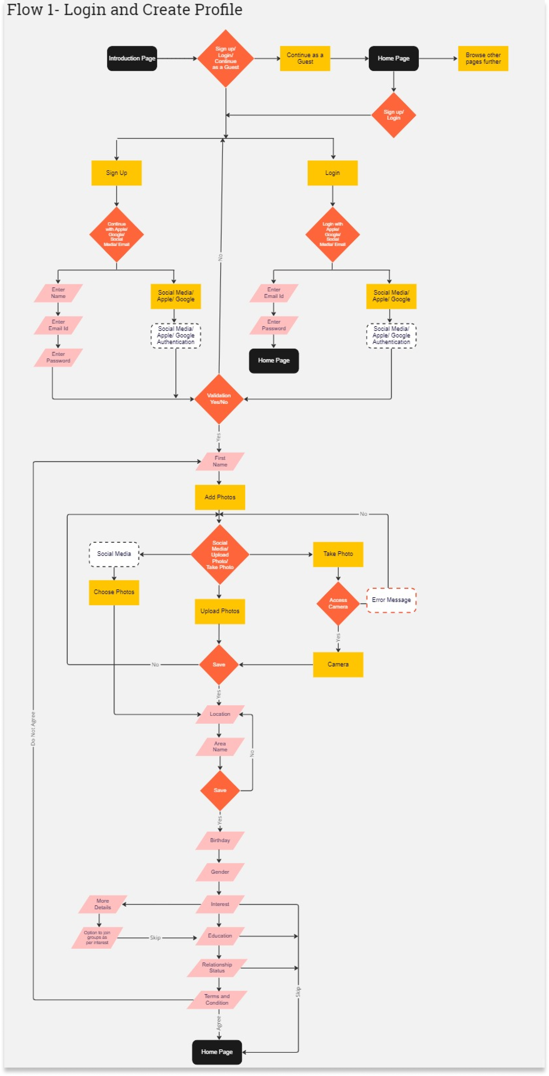
To optimize a users ability to complete a task the user flows was created.
Flow 1: Login and create a profile
Flow 2: Connecting with a individual, explore activity and research
Style Guide
Logo Design
Logo serves two main purpose, clear identification and meaningful communication.
While designing the logo, I wanted it to be simple and also showing the brand’s personality of connecting people.
To achieve that I designed the letters such that it represents people standing in a group circle and two individuals connecting in between.
The resulting logotype are both visually striking and unmistakable while adhering to the brand values of Inclusive, Exciting, Caring, Trustworthy.
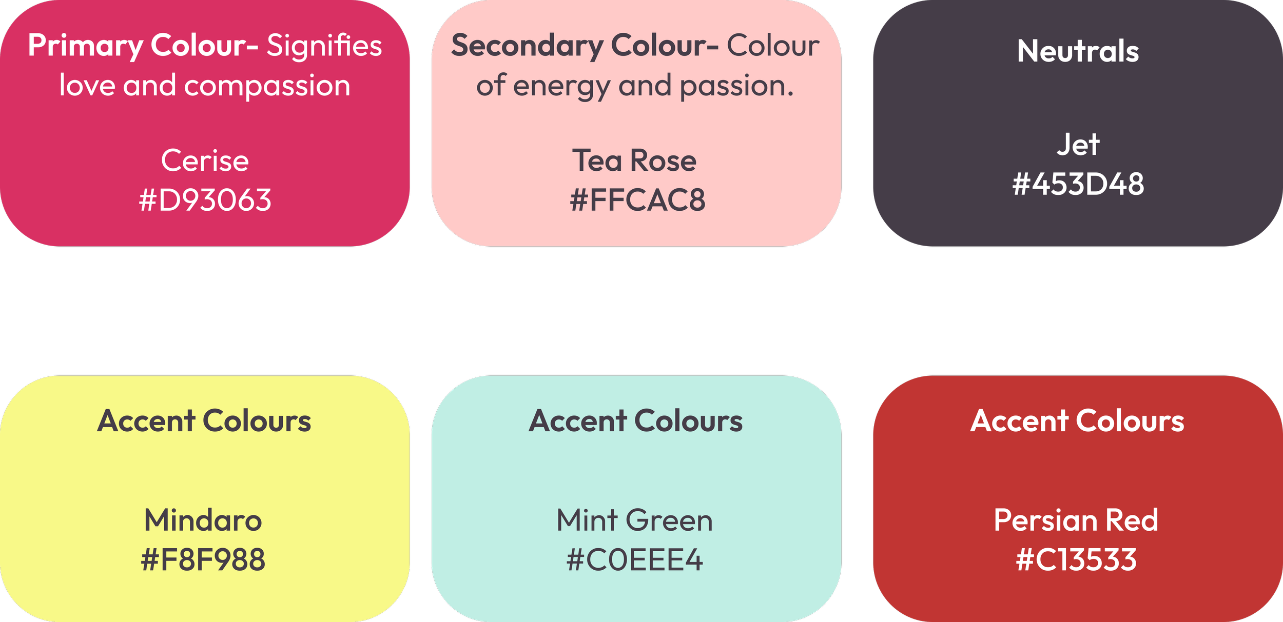
Color Palette
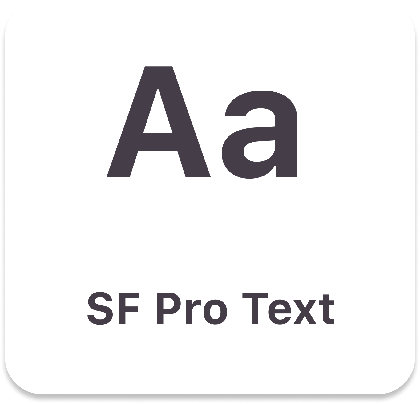
Typography
Icons
I chose outlined Icons instead of filled with rounded edges so that it describes my brand attributes Trustworthy, Exciting, Caring and Inclusive well.
Buttons
Bottom Navigation Bar
Low Fidelity Design
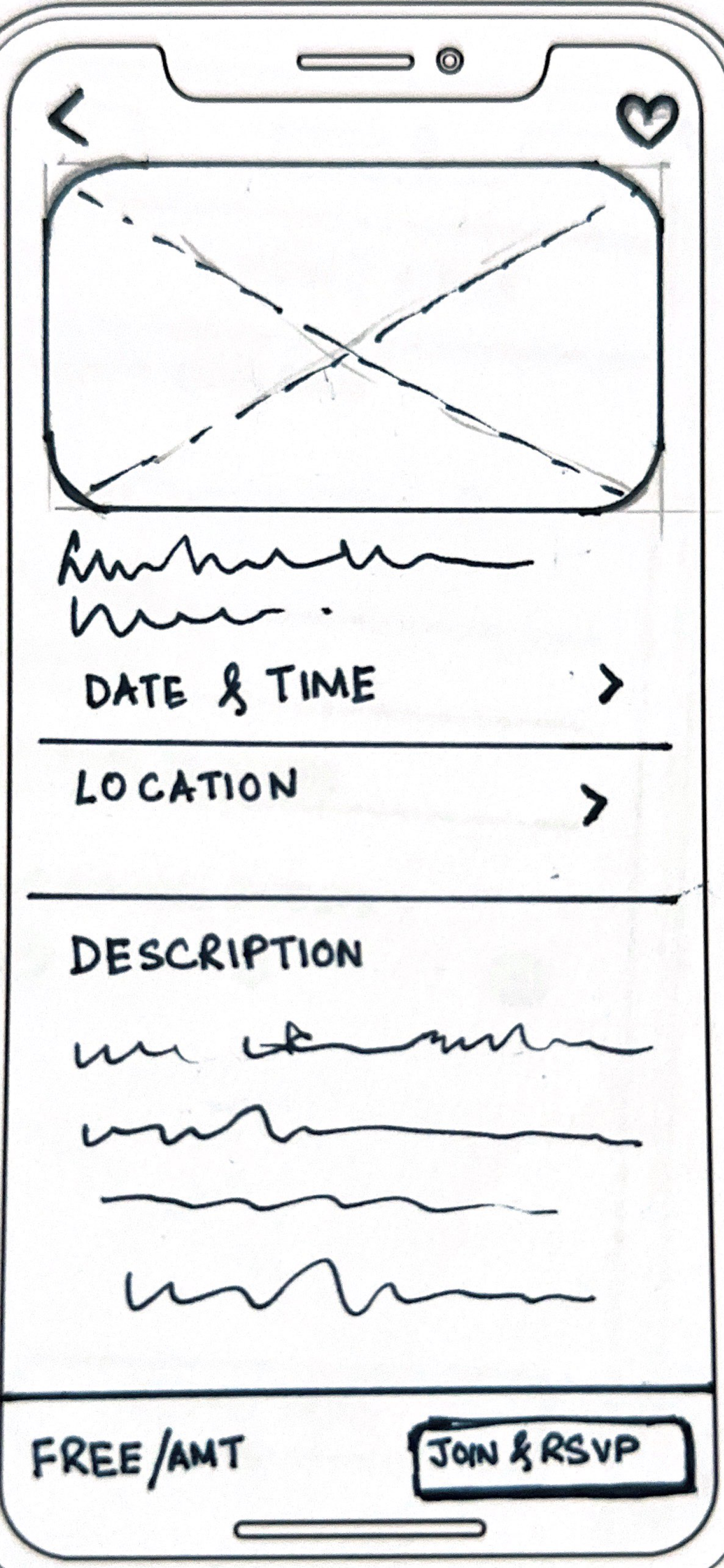
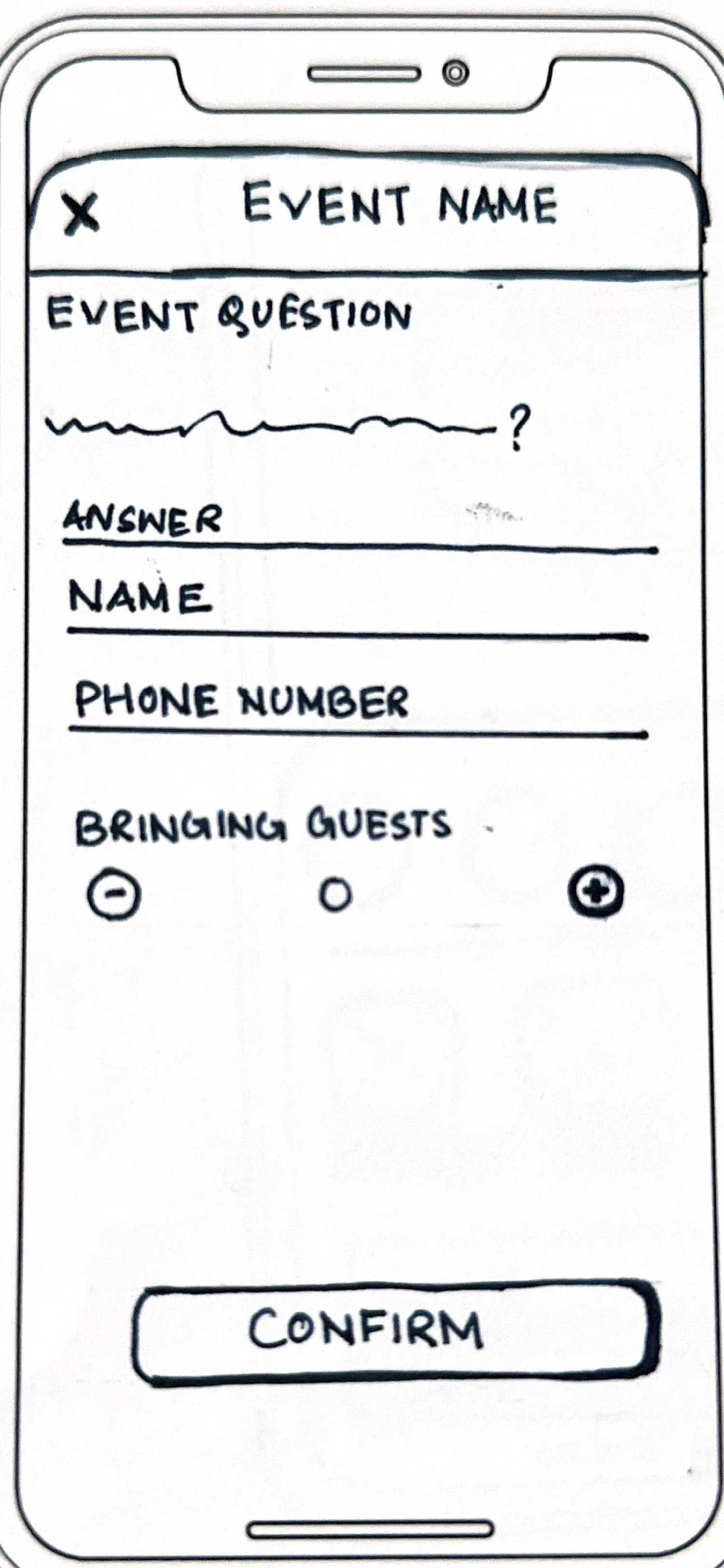
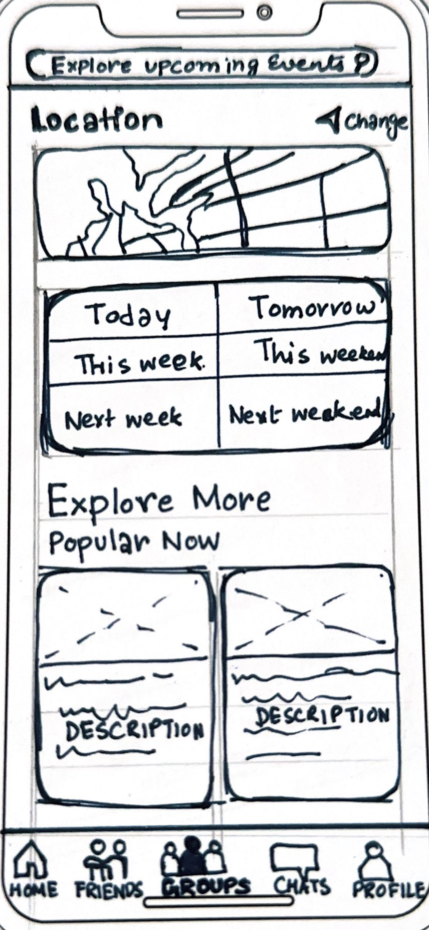
I sketched over 20+ plus screens which helped me to get a quick idea about look and feel of the screens. Also it helped me understand what are the important informations that needs to be included to make it an intuitive app. By sketching the process becomes much faster to make your ideas into a realistic design. With the sketches in front of me the next step of designing the wireframes became much easier.
Sign up
--------
Sign up --------
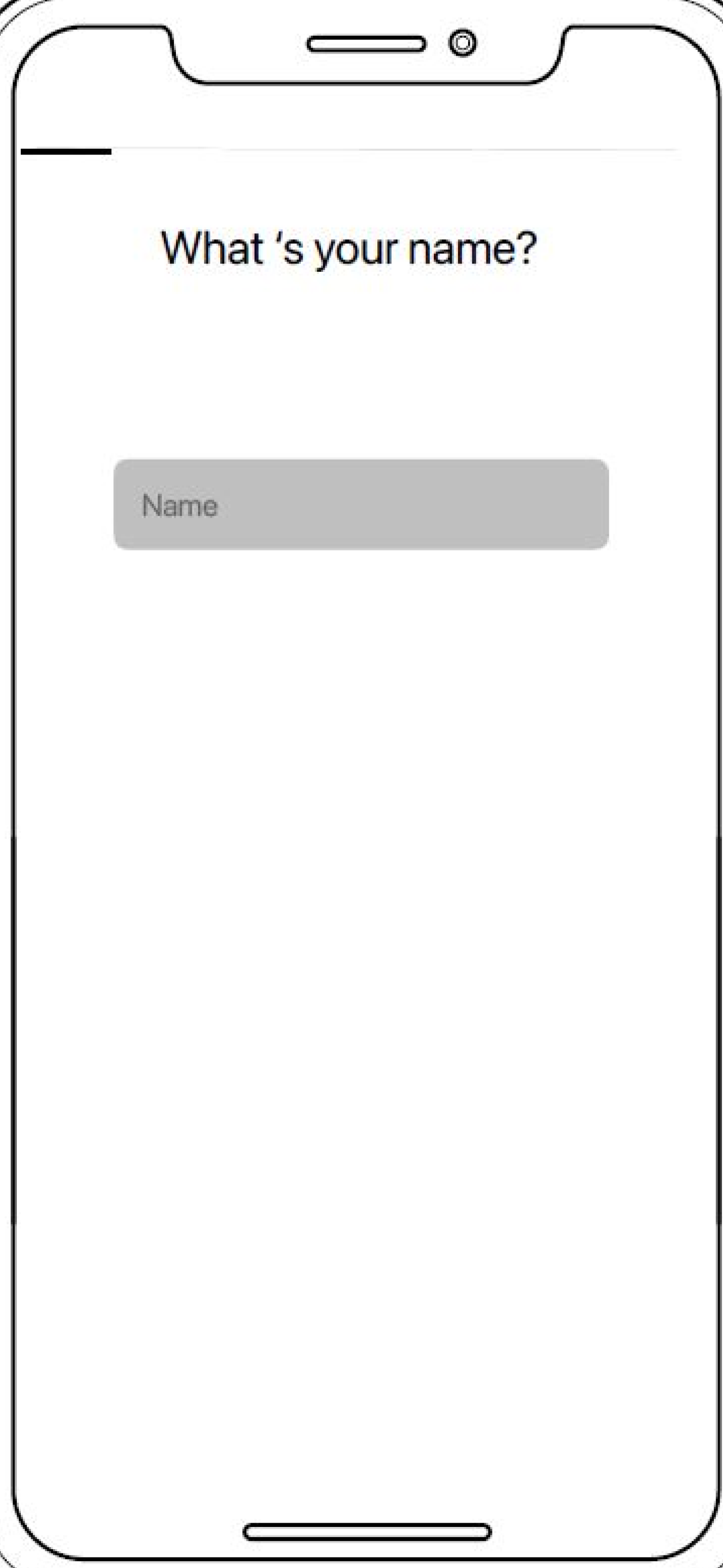
Profile setup
--------
Profile setup --------
Main Pages
--------
Main Pages --------
Wireframes
After polishing the sketches I generated the wireframes mainly to understand the layout and placeholders of each screen. This process helped me chalk out the wire flows which becomes a stepping stone to design the interactive prototypes. I wanted to make sure that these wireframes had enough details so that the users understands the flow of tasks given to them during the first round of usability testing.
High Fidelity Prototypes
Onboarding Screens
Insights after usability testing:
The onboarding screens didn't convey the theme and main purpose of the app. Also it wasn't interesting enough to excite the users.
Create a Profile
Insights after usability testing:
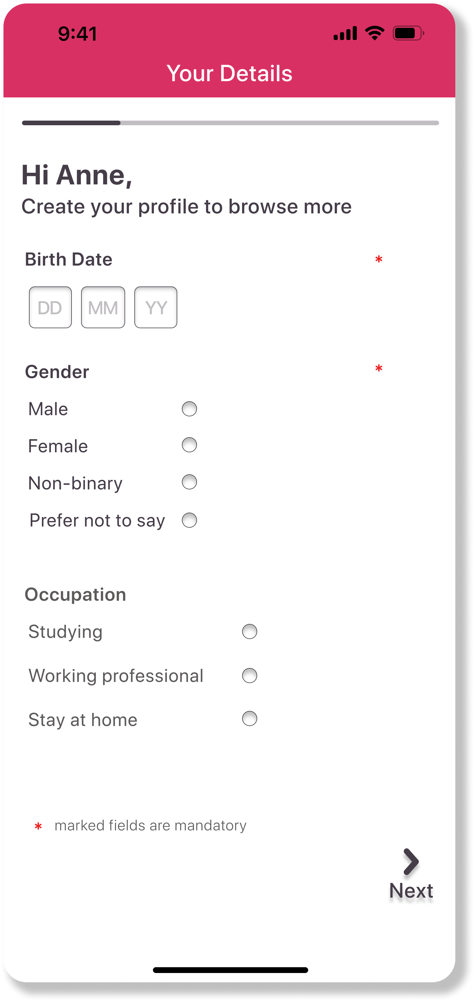
The process to create a profile was lengthier as compared to the final design. Users were not comfortable in answering few questions and felt them to be too personal.
Insights after usability testing:
The home page and events page design were very busy with very less spacing. There was no particular focal point.
The ‘Undo’ button on the friends page was misunderstood by mane user as a ‘Back’ button.
Home Page, Friends Page, Events Page
Usability test
I conducted two rounds of moderated usability tests online. Interviewing five user per round helped to,
Final Designs after Iterating
Onboarding Screens
These onboarding screens serves two purpose:
Conveys the purpose and essence of the app.
Allows users to Login/ Signup
User has to enter only the mandatory details marked with *.
Add at least one profile picture to get their account verified.
Select their interest or can even skip the step.
Finally Agreeing to the terms and conditions to enter the app.
Create your Profile
Home screen
Group screen
Events screen
Friends screen
Conclusion
This was my first project as an UI/UX designer, hence it was an exciting journey for me. I chose this topic because I had recently moved to a new country and was facing similar societal differences. So I grabbed this opportunity to find a solution and understand people’s mental space and their behaviour towards a new environment.
Being associated in every stage of this project I got to do my first user interviews. I learnt how to interact with users, how to make them speak their mind and understand their body language. To understand and solve the minute details of the product I carried out the usability testing, which made me believe that user satisfaction should be the ultimate goal for any project.
In future I would like to expand the functions of the app more. Now it caters to making friends , discover groups and attend events but in near future I would like to introduce a function where the app could provide information about relocation procedure to a new country, weather guide of cities, cultural details of the place etc. I want this app to be a one stop solution for anyone who is relocating to a new place.

