Savr Recipes
A mobile app designed during a design sprint for home cooks to accurately and easily follow recipes.
PROJECT OVERVIEW
Savr is a new startup that shows hundreds of recipes and cooking tips for at-home chefs. They have and active community of users who rate and review recipes for other users.
Problem: But recently Savr has seen some negative reviews about recipes that include several steps, or more advanced technique. Many people who were excited to see new recipes end up disappointed with the outcome, because they didn't fee instructions were clear or easy to execute.
Solution: I used the modified GV Design Sprint method to build a prototype which will help and allow users to accurately and easily follow cooking instructions.
Role: I was the only one working on this project so I was in charge of all the process that I followed for the 5-day sprint

DESIGN SPRINT PROCESS
‘Start at the end’
Sketching of the solution
Lighting Demos
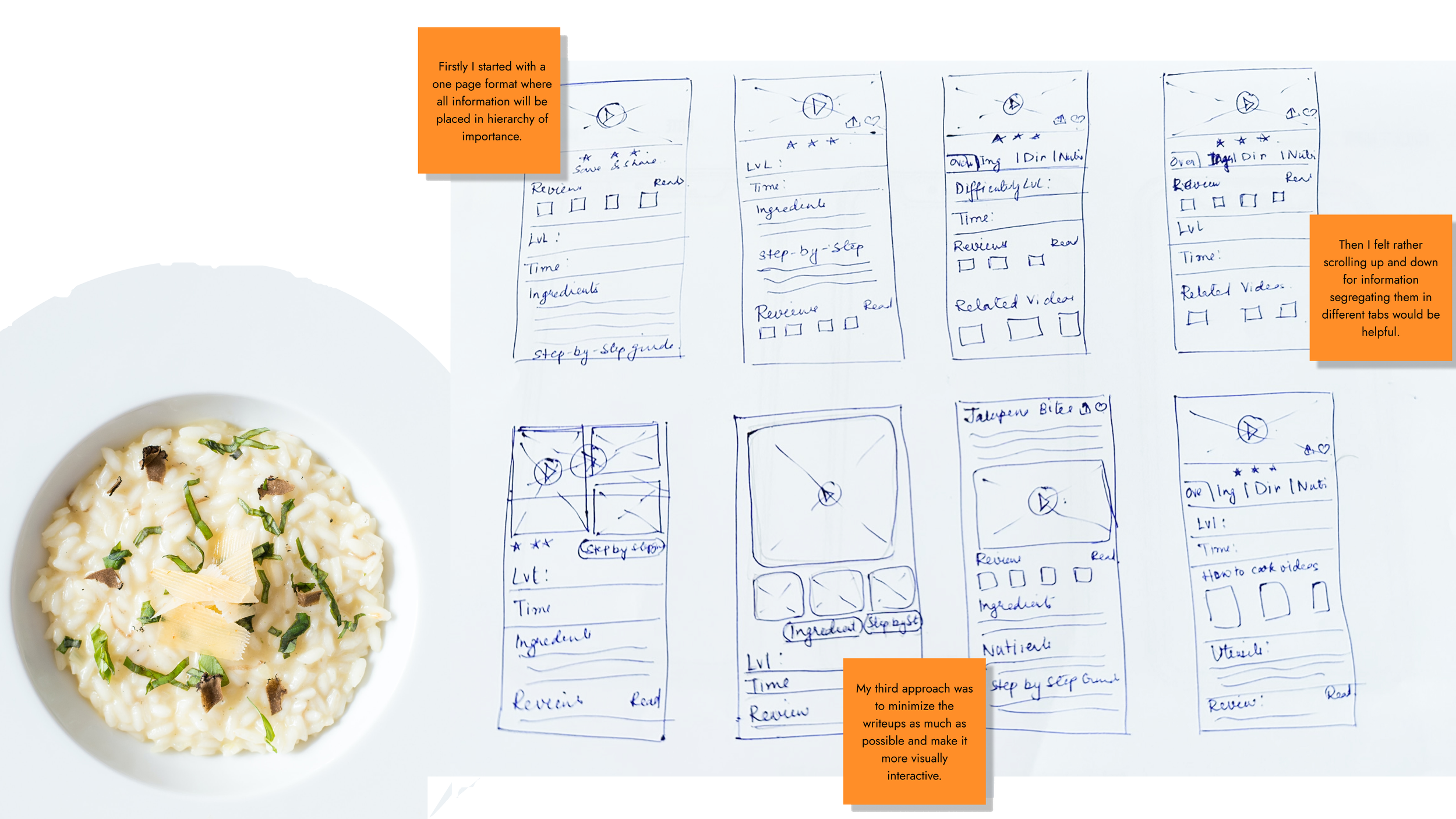
Crazy 8’s of the critical screen
Finally a three panel board of solution sketch
Understand and Map
Understanding the Problem
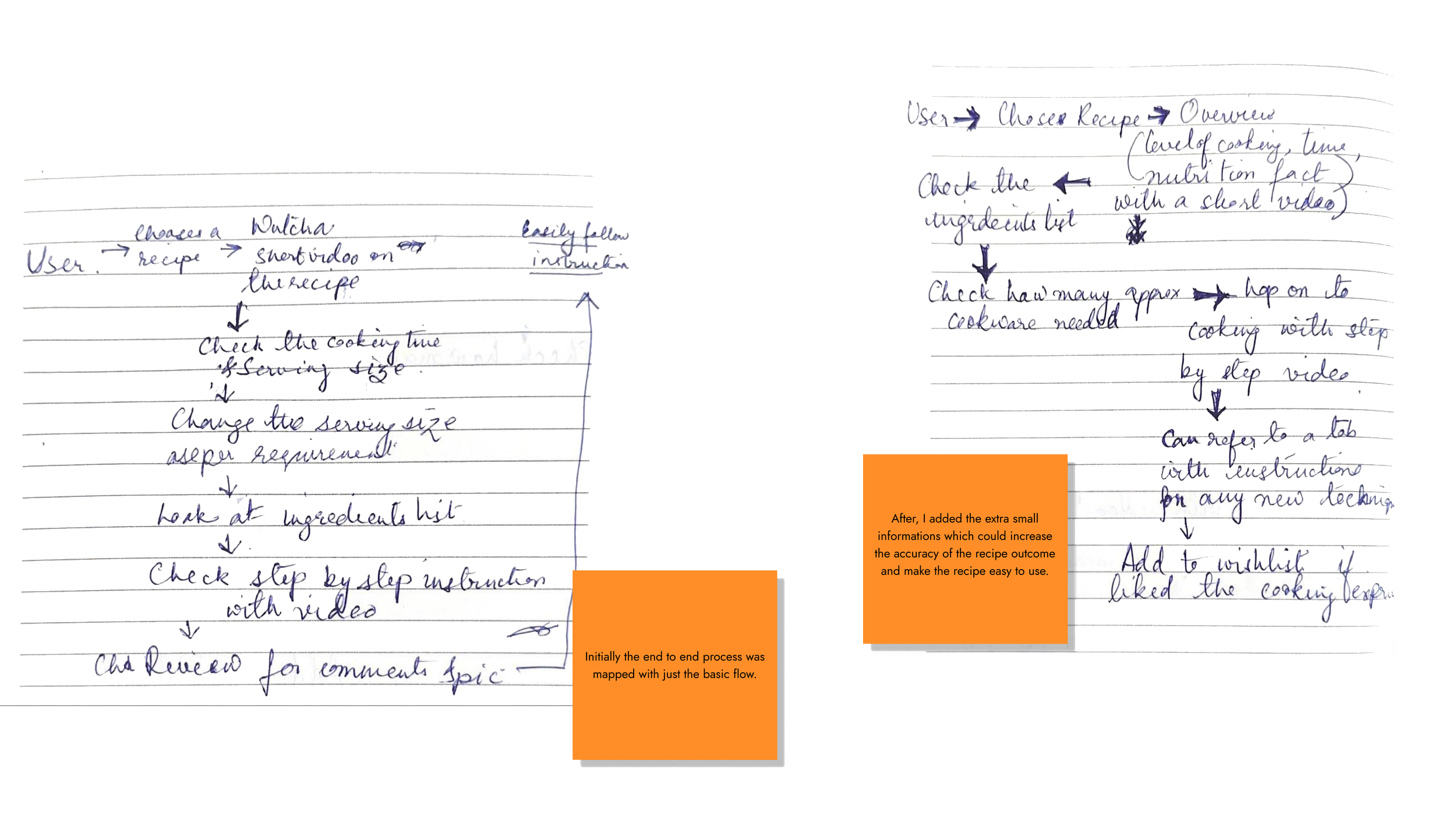
Mapping the possible end to end user experience
Creating a storyboard
Creating 5-15 panel story board
Prototyping
Design a interactable version of the solution
User testing
Testing the product with 5 users
DAY- 1
Research Highlights
Savr has a variety of recipes and it gets a lot of positive feedback from their user about their recipes. But off late they are facing some negative review on the accuracy of their recipe timings, order of steps and learning new techniques.
On going through user interviews I got to know the main pain points of the users,
Not knowing what kind and how many kitchenware to use makes the user end up using a lot many utensils.
They know how the end product is going to look like but in between the process they don't have any reference image or video to refer.
“Sometimes I feel steps are sprung on me...and that turns and enjoyable experience into a stressful one. I like to be as prepared as possible.”
Sometimes the new techniques used are uncommon to the user and they have to Google search, needing them to drop what they were doing to use the phone.
“Timing everything together can be stressful for more complex recipes. Sometimes I have to reheat a dish.. that's a bummer when you take the time to make something fresh.”
DAY- 1
Map
Lighting Demo- Tasty, Yummly, Kitchen Stories
DAY- 2
DAY- 2
Crazy 8’s
After studying the competitors in the market I chose to get into the Crazy 8’s method with the critical screen.
The main drawback that I am solving today is to make users follow a recipe easily and accurately. To achieve that, first thing a user would like to see is a quick short video of the food, rating, difficulty level and time required.
So my critical screen became this page where all the important information will be available for a quick reference.
DAY- 2
Solution Sketch
DAY- 3
Decide and Story boarding
A solution which makes eliminate the thought, of following a recipe online while preparing food is a hassle, was my main goal.
To take care of that I tried to make navigation more smooth and all the minute, but very useful features were designed such that they are easily accessible.
For Storyboarding I created total 13 panels showing the rough flow of user.
As studied, I started the flow right from where the user will download the app i.e. Apple store.
After download the app the user will likely Login or Signup.
On selecting the recipe from Home screen the user will get to all the details related to the recipe which can be accessed by clicking on the four different tabs.
After they decide they go on to see the ‘Step-by-step’ guide of the recipe.
Once they are done they can leave any cooking tip or review to help other users improve.
Day 4
Prototype
While prototyping my thought process was to create a space with almost all the feature a user might need while checking out a recipe online.
Firstly I segregated the information's in four different tabs so that browsing becomes smoother.
This app shows the users about the type of utensils required.
As a designer I considered that any cooking technique as basic as possible can be unknown to the user and hence introduced a section with these mini ‘How to do’ videos.
Each phase shows the timings separately.
Ingredients list specifies how the vegetable needs to be cut.
A ‘Step-by-step’ guide with a mini video will help the users relate with the process better.
Day 4
Prototype
Day 5
Usability Testing
I recruited 5 users for my usability testing. Four of them were from the Slack Community and one is my friend. I scheduled all the calls on Zoom and it was conducted online.
It began with a brief description about the project following by assigning tasks.
Since the screen sharing method was used I could also see the users body language. Few of them went through all the details before hoping on to cooking were as few of them just checked the list of ingredients and decided to proceed to cooking.
Certain tasks which I thought users would complete easily took some time and certain tasks were completed before the expected time.

Day 5
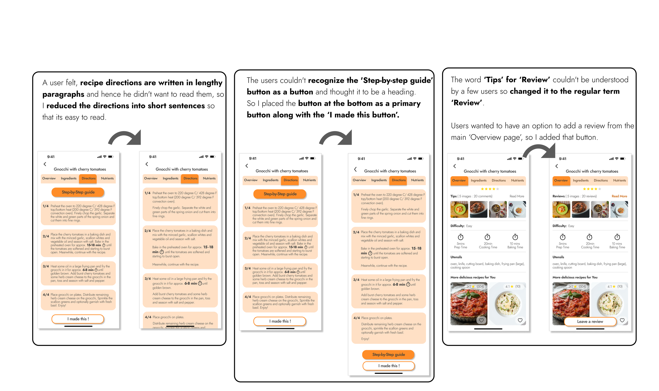
Results and Iterations
Conclusion
Design Sprint is a very interesting and fast moving process for those products where few sections of the design needs to be modified after the launch or for projects which needn’t be build from scratch. During the five days of Design Sprint, in a team a lot of ideas can be generated in a very short span.
I was given some idea options where the research part was already done and from those insights I had to build a solution sketch, High fidelity mockups and carry out one round of usability testing.
Nowadays referring to recipes online has become very common and myself being a part of that crowd I feel recipe pages are so overcrowded and unorganized that it leads to frustration which leads to opting out of the app.
While doing the competitive analysis I realized that a designer should not consider any information as unimportant because every user is different and might look at things differently, and if he/she doesn’t find any related information then that might directly affect the conversion rate of the site. So I made the design thinking with a users perspective. I segregated the information in different tabs so that the user can see all the main headings rather than scrolling till the end of the page, designed a section where the users can look into mini videos for any new type of cooking process, also added videos for each step of the cooking process because reading does not give the clarity every time whereas a video can clear a lot of doubts.
After reading the user interviews I tried to solve the pain points of my users so that it becomes more intuitive and gives seamless experience to my users. They should be able to trust the app and becomes one step closer in making their lives mor simpler.


