PROJECT OVERVIEW
The Problem
It’s hard to keep track of all the products and services that we subscribe to each month. All we see is money deducted from our accounts for services that we might not even need or want anymore. A company has a product that keeps track of all of your subscription fees on websites, apps, services, etc. over the years.
This company has only launched a desktop-only website that is not mobile-friendly and now needs to create a mobile version of its product that can be used by a broader audience. Right now the company only benefits from desktop users but they know that adding a mobile-friendly version of their product will significantly increase their market reach (with more than half of potential users on mobile devices). This will ultimately result in more users and more business.
Scenario
Now a days consumers are subscribed to so many services it becomes very difficult to keep track of all of them. SmartSubTracker is an app which helps user manage their subscriptions and keep track of their expenses.
The Goal
Design an app so that users can see all their subscriptions in one place to get a comprehensive view of their spending on subscriptions.
To reduce needless spendings the users would be able to unsubscribe from a subscription very easily.
Users want to be notified if any of their subscriptions are about to be auto-renewed so that they can make a decision about if they want to renew the subscription and continue spending money.
My Role
As a UI/UX designer I was the one and only person responsible for the whole project. Since time was quite limited and there were no groups involved I chose the faster methods to reach the goal of project. This project was completed in a months time and Figma was the primary software used to deliver the project.

DESIGN PROCESS
DISCOVER
Study Industry Leaders
Track My Subs
You can enter the subscription value in any currency and it automatically converts into the local currency.
The subscriptions can be paused also instead of completely deleting them.
Likes
Dislikes
UI is very basic and does not grab users attention.
There are too many action buttons inside the edit page, confusing the user.
Subscription Tracker
The process to add a subscription is very simple and easy, can be done by any new user.
With the ‘Made Payment’ option one can also update their payment status.
Likes
Dislikes
While deleting a subscription with a swipe it fails to ask a confirmation from the user.
There is no option to set different time for different subscriptions. One master timer can be set for all alerts together.
Subly
The UI is very clear and neat demarcation of each section.
The subscription can also be moved to inactive section when the user just temporarily want to stop the service.
Likes
Dislikes
The subscriptions are not arranged in order of payment date.
Multiple Selection to delete subscriptions is not available. It has to be deleted individually.

SECONDARY RESEARCH
In 2020, the Better Business Bureau reported that customers lost an average of $140 and had lodged more than 58,000 complaints about free trials and automatic renewal subscriptions over the past three years.
- source Internet
Today most companies have a subscription model for users to access their premium features. There are three types of services: SaaS or software as a service, CaaS or content as a service, HaaS or hardware as a service. Every service now comes with a subscription. It's the idea that software isn't just bought once and installed but it is subscribed and always updating.
The subscription market has been up every year in every industry be it ecommerce, video streaming, music etc. As the business era of subscription is slowly emerging, the users need an efficient and effective medium to manage their subscription.
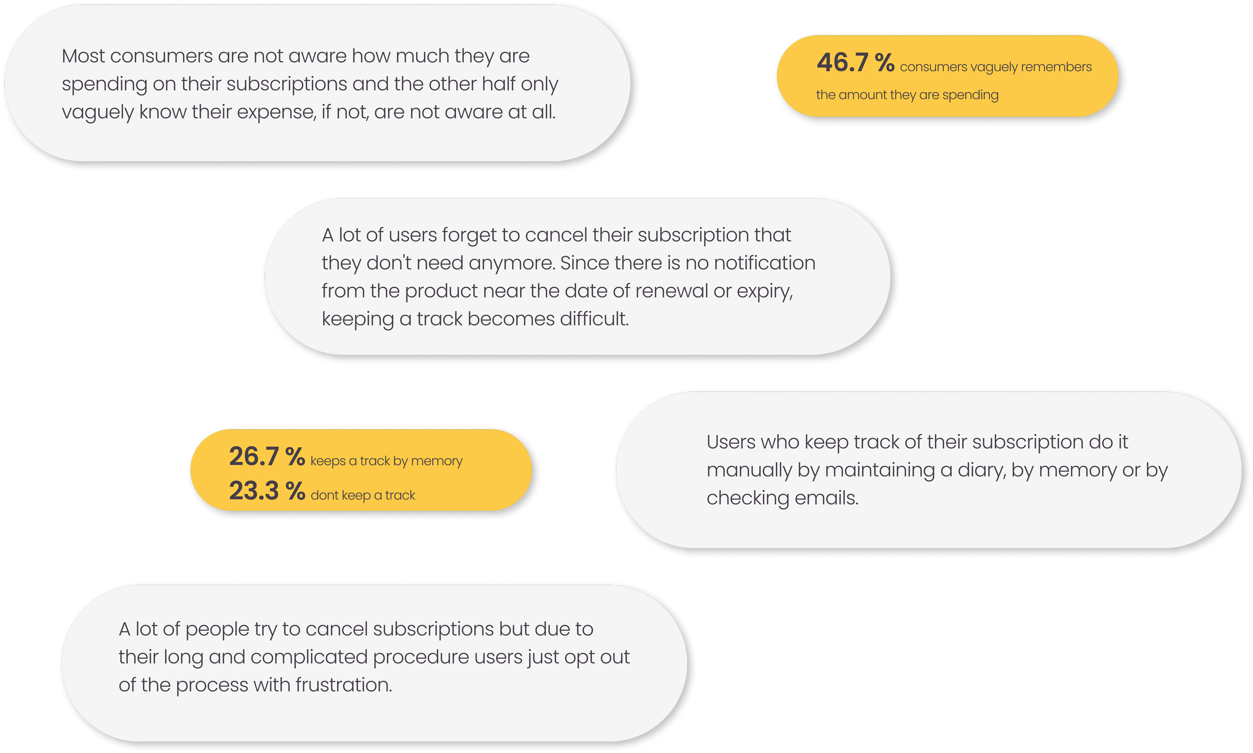
Keeping track of subscription plans is a challenge, particularly when it comes to knowing how much all these recurring payments amount to, and knowing the date of renewal of subscription plans (due to the lack of notifications sent from the products/services).
- source Internet.

SECONDARY RESEARCH FINDINGS
DESIGN
User Flow
To enhance the customer experience and keeping in mind the ultimate goals I designed the user flows. The user flows were designed such the frustrations and pain points of users can be addressed.
Add a Subscription
Pause /Delete a subscription
Add a Reminder

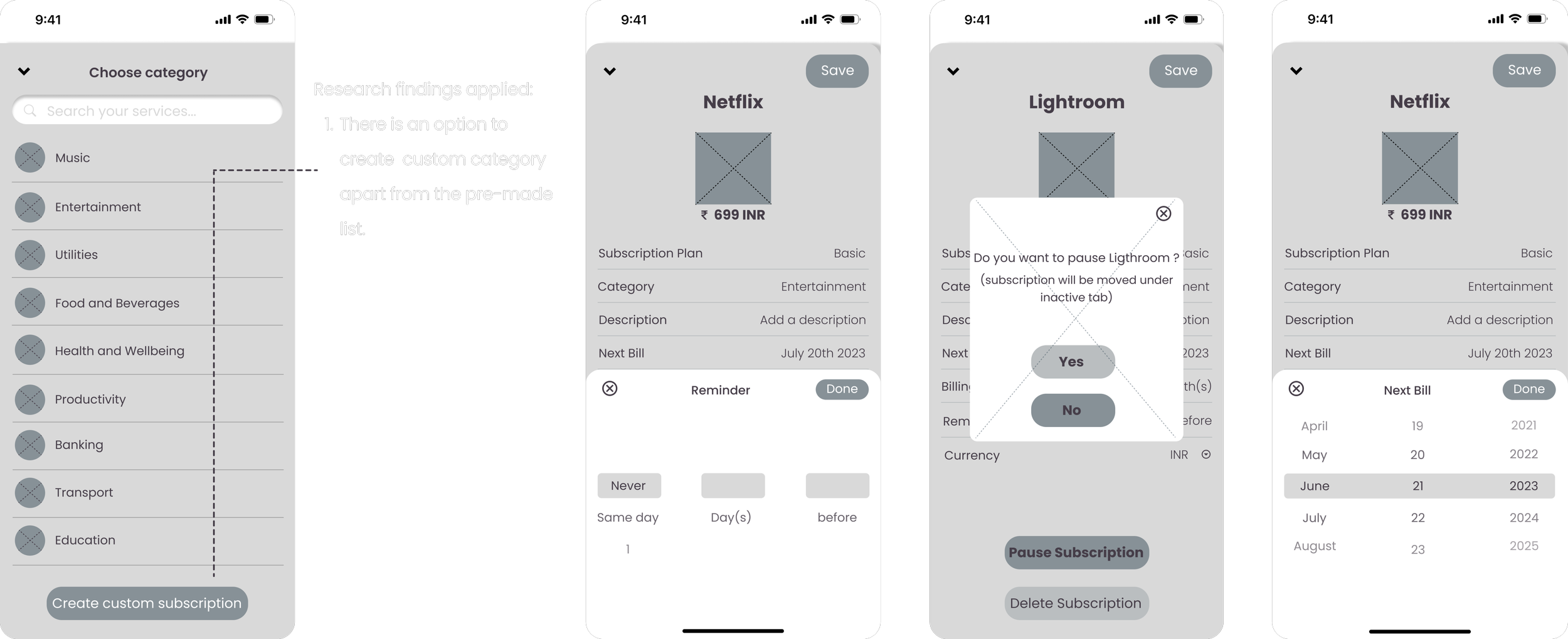
Created the wireframes for the above user flows to understand only the important interactions the users are going to have.
WIREFRAMES


VALIDATE
Usability Test with Wireframes
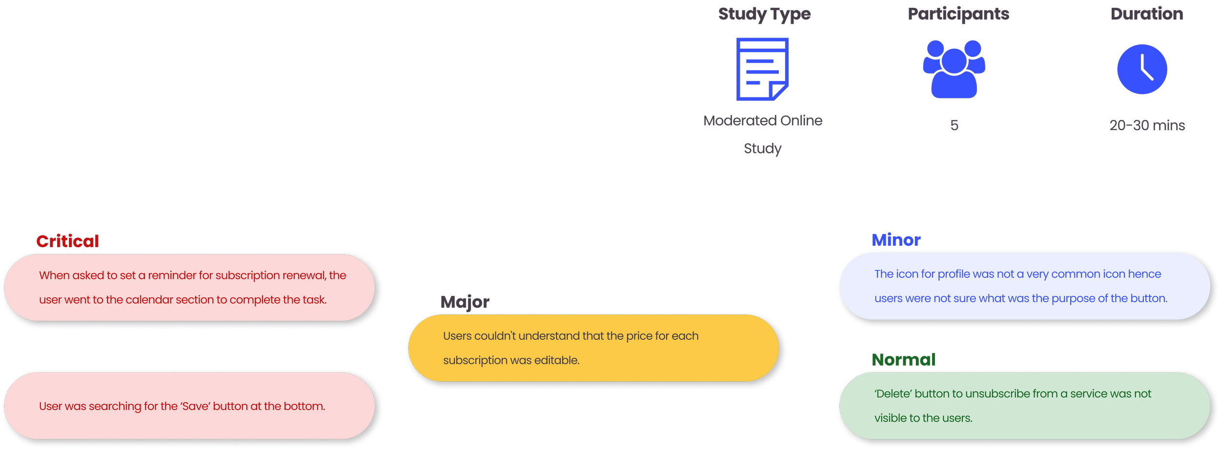
To validate my low fidelity prototypes I conducted my first round of usability tests with five participants, whom I had recruited from Slack community.
DESIGN
Style Guide
High Fidelity Prototypes
Home screens
The first screen state is just after users logins and yet to add their subscriptions. The second screen state is after the user adds their subscription. Each card shows the due date and the amount they are paying. On top of the screen the user can see their total expense and adjust the sum as per day, week, month and year.
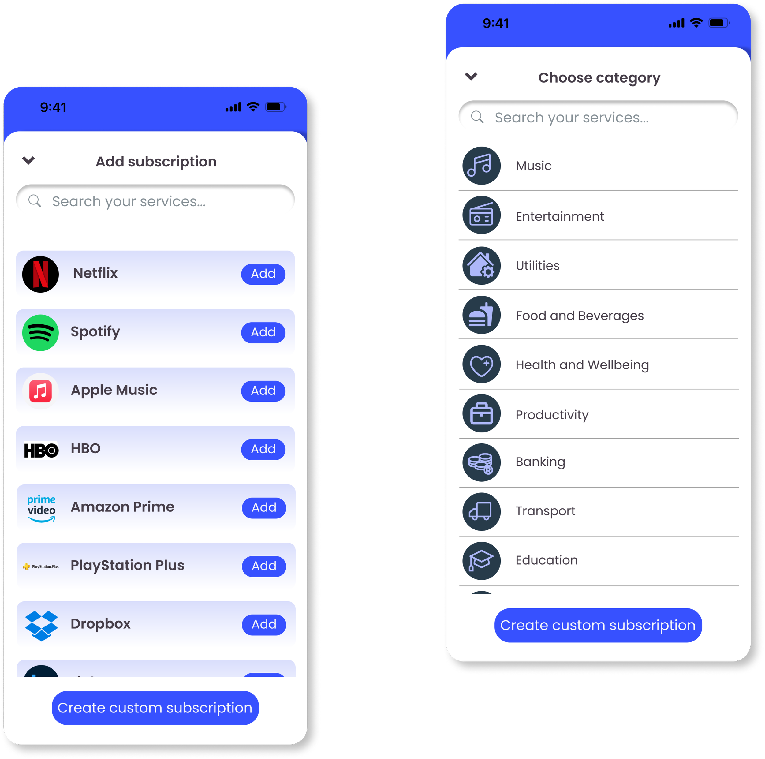
Add subscription and add a category
There is an option to create a new subscription and a new category if they are not there in the premade list.
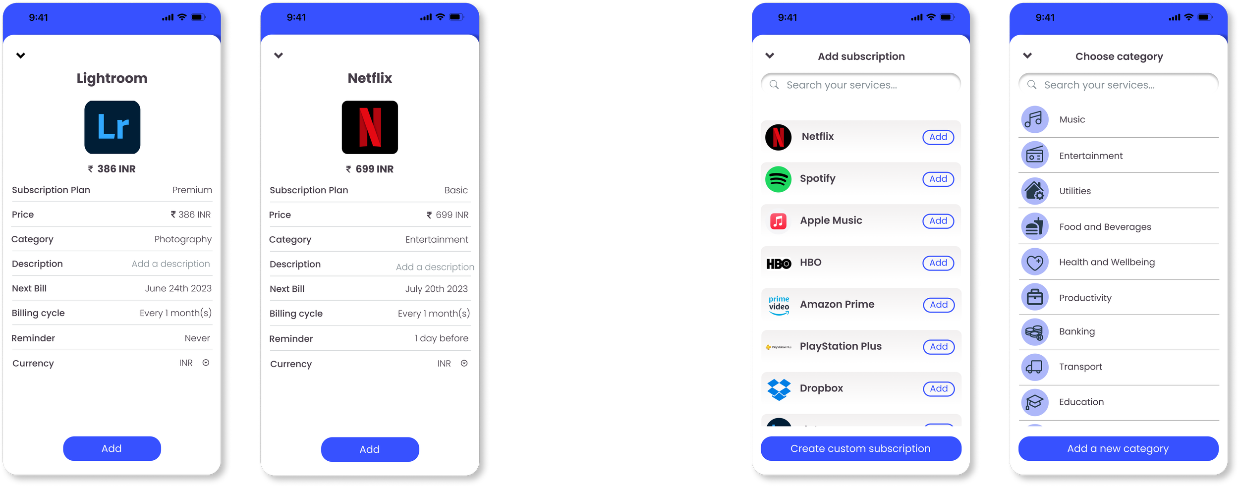
Subscription Details
In the specific subscription details page it will show the billing cyle, billing date, an option to set a reminder. Also a user can set their currency and specify a category.
Delete or Pause a subscription
There is an option for users to pause the subscription instead of deleting it.
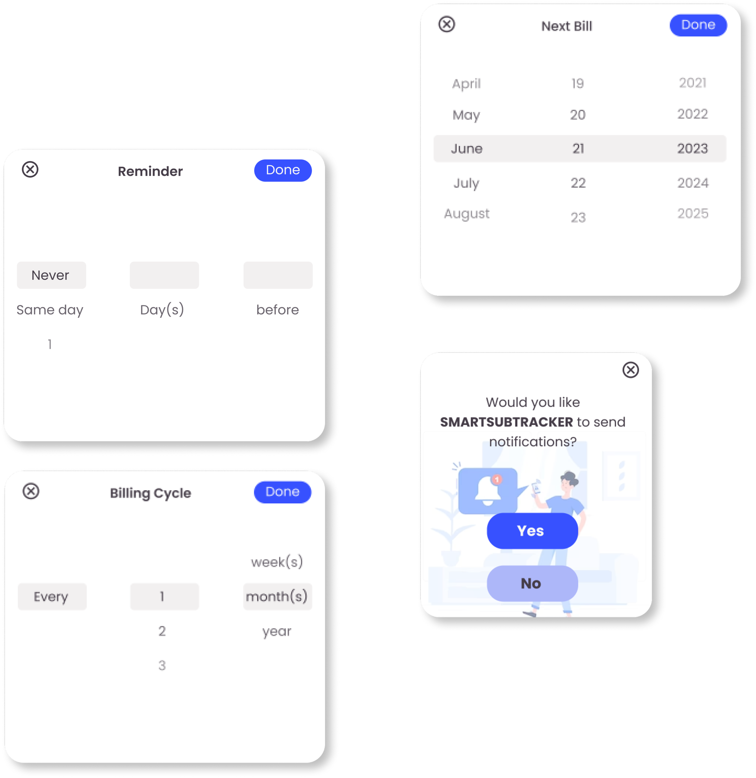
Modal windows for setting reminder
The user has the control to set a reminder and adjust as per their wish, also they can set the billing dates and change the cycle of subscription. There is also a confirmation or permission taken from the user before changing any settings.
Analytics and Calendar view
Analytics will help user understand their usage and expense in a better way. With the calendar, viewing the subscriptions becomes very easier with just one click.
VALIDATE
Usability Test with High Fidelity Prototypes
The second round of usability test helped me to refine the design more and produce a more user friendly app.
FINAL RESULTS
Brought consistency to the design by modifying the logo shapes and fill color.
Changed the icon to add a subscription.
Introduced the app logo on the homepage for better clarity to the users.
Mentioned the exact due date for each subscription on their respective cards.
Modified the hierarchy of ‘Add’ button and ‘Create custom subscription’ button.
Changed the colors of category icon to match the design style.
Subscription Detail
Marked the dates having subscription due dates with more clarity so that at the first glance itself the user understands where to click.
Modified the color of bars and charts to make it harmonious with the design style.
Introduced an option for the user to keep a control over the duration of pausing a subscription.
Made the ‘reminder’ modal window free of confusion.
Put some extra information on the confirmation windows so that the users doesn't forget to update the same information on the respective app.
CONCLUSION
For this project I had total 90 hours to complete. It was challenging because it had to be planned out well and stick to the same project plan in order to deliver in time. To save on time I had chosen some of the faster method of research and low fidelity prototype.
Instead of going with the user research I opted for the secondary research method. During my research I found lots of case studies and websites which had discussions on the same topic. Hence I could find ample amount of information supporting user pain points or how the users are managing currently without a similar app. In the designing stage instead of sketching first and then converting them to wireframes I directly designed my first cut designs as wireframes and conducted my first round of usability test.
Though I had done usability testing for my previous projects but every time its a new learning and its is really unpredictable how each and every user thinks . The thoughts and perception that I carried while designing were a lot different from other users while testing. Hence the biggest lesson I learnt was, design should always be user centric and we should consider every information as valuable as every user has a different perception.
In future I would like to develop this further. I would like to make it work in real time and sync with other apps so that the information’s are auto updated and SmartSubTracker can be the single point of access for all other apps. This will make life so much easier, reduce any amount of confusion and also cut down on unnecessary expenses. Further this app can be connected with bank accounts and other mode of payments so that users can renew subscriptions for other products through this app.


