
Project Overview
With Waggle, managers are able to know exactly what to do and when to do it to drive team performance. Managers are also able to up-skill themselves to become stronger managers by leveraging Waggle's AI, data, and behavioral science-driven collaboration tool. 150 managers joined their private beta including 30 paid and a growing waitlist of managers. All with zero marketing spend.
Currently their conversion rate from visitor to sign up on the website (free membership plan) is 2% - 3% which they want to increase to 5%.
The Problem
The Solution
The main goal is to increase the conversion rate of their website by urging the users to go and hit the ‘Sign Up’ button. For the users to ‘Sign up’ we had to design the pages such that the user understands what does the brand offer and how will it help them for their betterment.
The design had to be appealing and standing out from their competitors . Nowadays the patience among users are very less so to keep their attention on the site we have to make the web pages short and at the same time conveying all the necessary information.
Heuristic Analysis
Competitive Analysis
To understand how the competitors are increasing their conversion rate or managing to get the users to sign up to their brand we did competitive analysis of three brands, OfficeVibe, ChartHop and Clickup.
Goals for the study,
Clarity about the brand’s objective
Signup procedure
Learn about the Homepage
Heat Map action in last 3 months
Before starting our design we studied the heat maps and user interaction of last 3 months. This helped us understand user scrolls and clicks which in return will benefit our design and make it more user friendly.
Low Fidelity Designs
Sketches
Final Designs
We did not deviate from the style guide and kept the same colors, only played with background shade which automatically lead to change in the color of the CTA buttons. The previous black background looked very aggressive and harsh to the eyes.
Since the website isn't live yet and work is still on progress they are yet to make demo videos of their app which would then be displayed instead of the image.
Initially random one liners were present in between sections which we felt was not necessary and was cutting the flow of the page.
The initial design on black background seemed very monotonous so we introduced icons and bulleted all the points to give it a lighter looks.
There was huge amount white space between sections which we adjusted to give a seamless look.
After studying the heat map we found that maximum percentage of people were hardly scrolling till the bottom of the page, so to rectify that we tried to make the ‘Why Waggle works?’ section compact by designing it in a tabular format. Users can click on each tab to read details about it.
We made the testimonials attractive and easily noticeable by mentioning the company name of the user and showing the star rating. Also instead of one huge testimonial on page we thought showing 2-3 testimonials together would be useful for the user.
We lightened this part of the section by changing the design from cards to graphical representation.
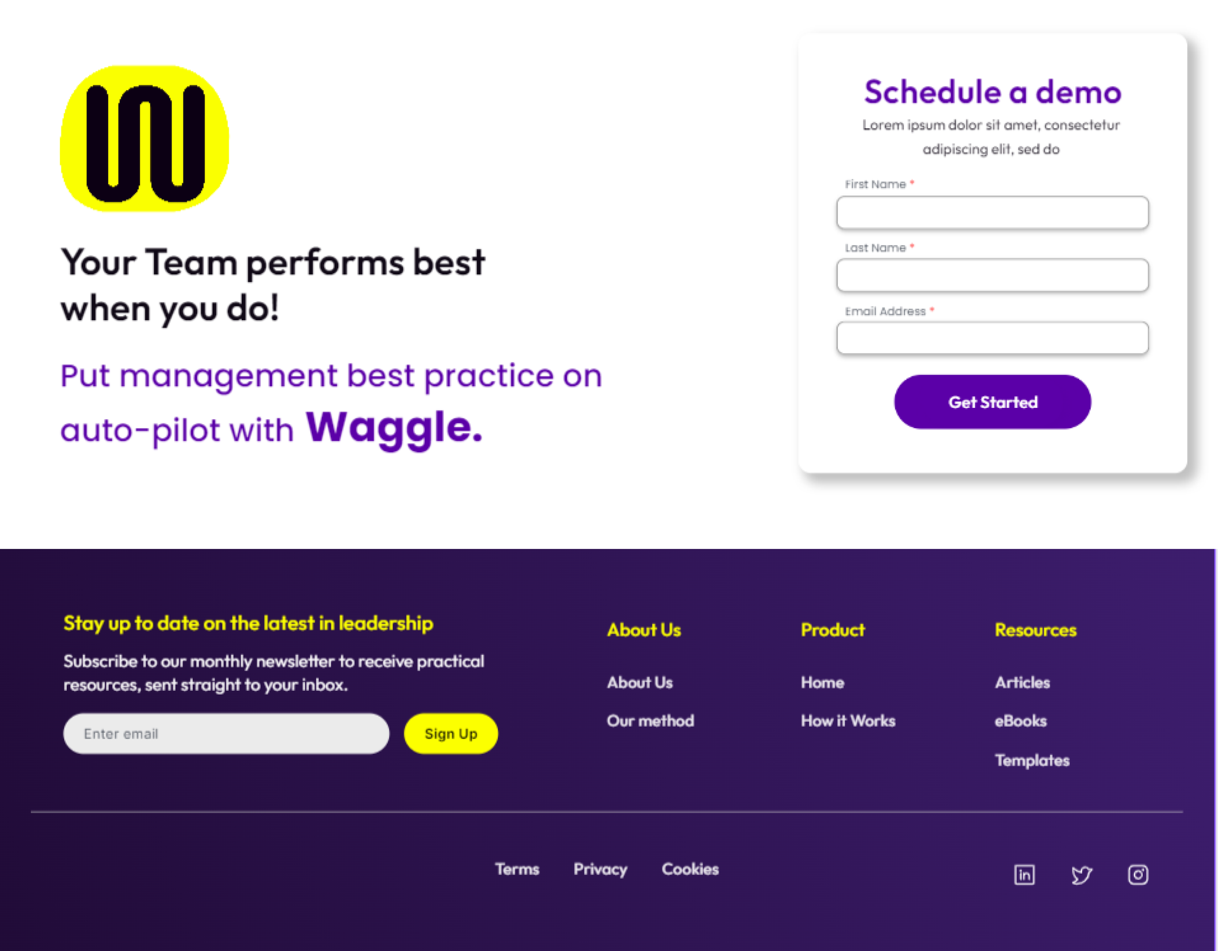
At the last section, after scrolling through the whole page if the users are interested and wants to see a demo of the app they can use this form to do so.
We removed the yellow background because it wasn't making any sense.
The footer we matched the color shade with the hero section to make the design cohesive.
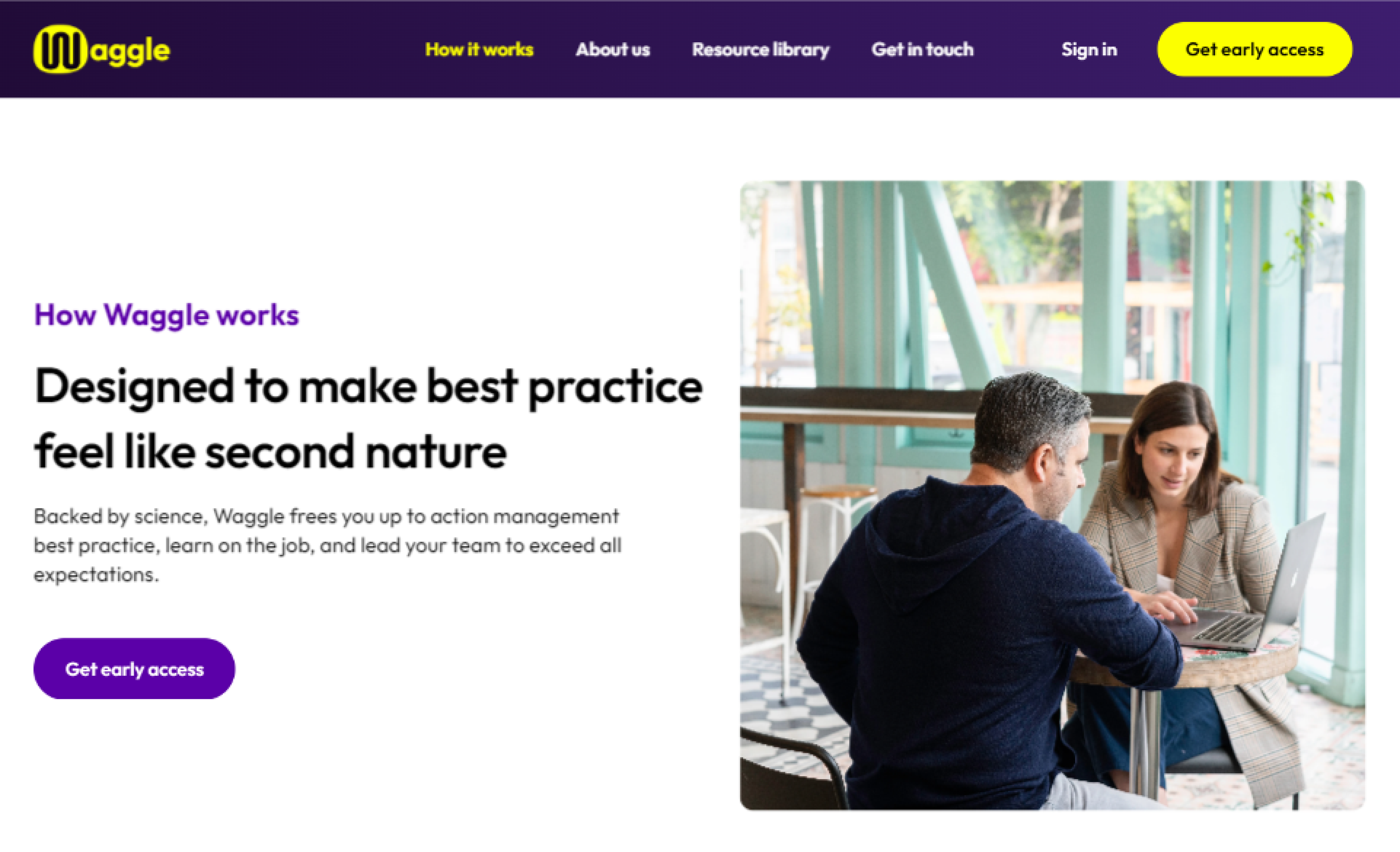
To give the hero section of the Home page maximum attention we thought of keeping the background of the top section in ‘How it works page?’ subtle and hence white.
Same like the Homepage we condensed this section of the page and segregated into different tabs to reduce the length of the page
Again instead of a heavy black background we made it white and aligned them with equal spacing.

Conclusion
This was the first time I was working in a real time project for a real company. There were three of us UX/UI designers and the CEO in the team who were interacting weekly over a Zoom call. Initially we started of with the project plan and chalked out the dates for the deliverable and then we segregated the work among three of us so that we achieve the target date. We didn't go through all the Design Thinking process because the research, usability testing, style guide were already done and we used these to derive inferences for our design.
By working in a group I got to learn that being accommodating towards the team members is one of the important factor to sail smoothly through any kind of deadlines. My team mates were proactive and ready to help each or take up each others work in any situation without questioning. While attending weekly meetings I came across so many platforms which can be used specially when working remotely in a group. These software reduced so much confusion and each one us were always on the same page without any information getting missed.
For the first time we studied videos of users interacting with the website and their respective heat maps which helped us get the ideas for our final designs. We got to use a new website builder FRAMER, which was challenging at the beginning but later got a hang of it.
Overall it was a good learning experience and we went out of our comfort zone and tried new software to add to our learning curve and with proper planning and work segregation we were able to fulfill clients requirement within the deadline.


